


Reading Gold Charts Helps Buyers Separate Price Noise From Market Direction
Learning how to read gold price chart movement is useful whether someone is buying physical gold, monitoring premiums, or comparing entry points for bullion. Gold prices can move quickly in response to Treasury yields, Federal Reserve expectations, U.S. dollar strength, inflation data, ETF flows, central bank demand, and geopolitical risk. A chart does not predict the future, but it can help buyers understand where the market has been, where traders are reacting, and whether price action is strengthening, weakening, or simply moving sideways.
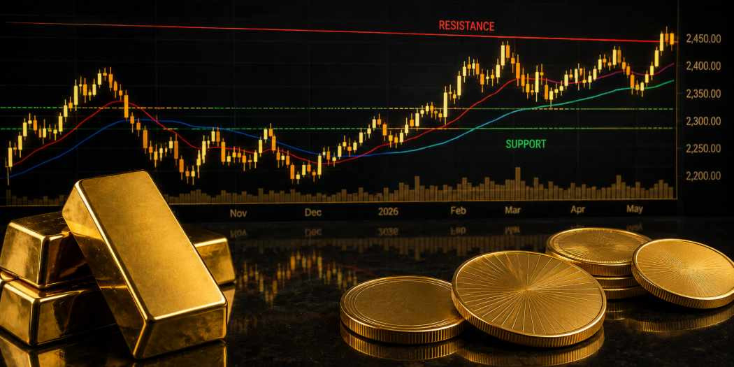
Three basic chart tools are especially helpful: support, resistance, and moving averages. Support shows where buyers have recently stepped in. Resistance shows where selling has repeatedly slowed a rally. Moving averages smooth out short-term swings and help identify the broader trend. Together, these tools give gold buyers a practical framework for reading spot price behavior without turning every small move into a major signal.
Gold Spot Price Behavior Starts With Timeframe
A gold price chart can look very different depending on the timeframe. A one-day chart may show sharp intraday swings around economic data or Federal Reserve comments, while a one-year chart can reveal whether gold is building a larger uptrend, correcting after a rally, or moving through a long trading range. Before analyzing any chart, the first question should be simple: what decision is the chart supposed to support?
A short-term buyer may focus on hourly or daily moves to compare bullion entry points. A long-term investor may care more about weekly or monthly trends. A collector purchasing a numismatic gold coin may use the chart to understand gold’s impact on the coin’s melt value, but the final price will also depend on scarcity, condition, mintage, and collector demand.
That distinction matters. A gold bullion coin or bar is closely tied to the spot price, plus product premium. A rare or low-mintage gold coin may move partly with gold but also carry a numismatic premium that chart analysis alone cannot explain. Charts are valuable, but they should be read in the right context.
Support Levels Show Where Gold Buyers Have Stepped In
Support is a price area where gold has repeatedly found buying interest. It is not an exact number. It is usually a zone where buyers begin to see value, short sellers take profits, or traders expect the market to stabilize. When gold falls toward support and then rebounds, that area becomes more important on the chart.
For example, if gold repeatedly dips near a certain price and then recovers, buyers may begin watching that area as a potential entry zone. If the metal breaks below support with strong momentum, the market may be signaling weaker demand or a shift in sentiment. A support break can also trigger technical selling, especially among traders using stop-loss orders.
For physical gold buyers, support can be useful because it helps avoid reacting emotionally to every pullback. A decline into support may simply be a normal test within a larger trend. However, support should not be treated as a guarantee. If macro conditions change sharply, such as a surge in real yields or a stronger U.S. dollar, gold can fall through a level that previously held.
Resistance Levels Reveal Where Rallies Stall
Resistance is the opposite of support. It marks a price area where gold has struggled to move higher. This can happen when traders take profits, buyers hesitate, or sellers view the price as overextended. Like support, resistance is best viewed as a range rather than a single fixed line.
When gold approaches resistance, the market is testing whether demand is strong enough to push through. If the metal fails repeatedly at the same area, traders may become more cautious. If gold breaks above resistance with strong volume or supportive macro news, that former resistance can sometimes become new support.
For bullion buyers, resistance helps explain why gold can pause even when the long-term outlook remains strong. A buyer watching a gold price chart may see that the metal is not “weak” so much as digesting a prior move. That matters during volatile periods when headlines can make every price change feel larger than it is.
Resistance also helps with patience. If gold is approaching a level where rallies have recently failed, some buyers may choose to wait for confirmation or buy in smaller increments rather than committing all at once.
Moving Averages Smooth the Trend
Moving averages are among the most widely used tools in gold chart analysis because they reduce short-term noise. A moving average calculates the average price over a selected period, such as 20, 50, 100, or 200 days. As each new price comes in, the average updates, creating a smoother line on the chart.
Shorter moving averages, such as the 20-day or 50-day, respond more quickly to market changes. Longer moving averages, such as the 100-day or 200-day, move more slowly and are often used to assess the broader trend. When gold trades above a rising long-term moving average, the market is often viewed as healthier. When it falls below key moving averages, traders may see the trend as weakening.
Moving averages are not magic signals. They work best as context. A gold price that dips below the 50-day average but remains above longer-term support may simply be cooling after a rally. A price that breaks below several averages at once may indicate a more serious shift in momentum.
Support, Resistance, and MAs Work Better Together
The strongest gold chart signals often appear when support, resistance, and moving averages line up. A support zone becomes more meaningful when it sits near a major moving average. A resistance level becomes more important when gold has failed there several times and the moving average begins flattening beneath it.
For example, if gold pulls back toward a rising 50-day moving average and finds support near a prior breakout level, that may suggest buyers are still defending the trend. If gold rallies into resistance while the 50-day moving average turns lower, that may suggest the rally is losing strength.
This combination helps buyers avoid relying on one indicator alone. A single chart line can mislead. Multiple signals pointing in the same direction can provide better context. Still, even combined tools should be balanced against market conditions, including inflation reports, rate expectations, central bank buying, ETF demand, and geopolitical headlines.
Market Drivers Can Override Technical Signals
Gold charts are shaped by real-world forces. Support and resistance may matter, but they can break quickly when a major catalyst appears. Inflation data, Federal Reserve decisions, Treasury yield spikes, currency swings, banking stress, geopolitical escalation, and shifts in central bank demand can all change the market’s direction.
That is why technical analysis should not be isolated from fundamentals. Gold often benefits when investors seek safety, when confidence in fiat currencies weakens, or when inflation concerns rise. It may face pressure when the U.S. dollar strengthens or when real yields climb, because higher-yielding assets can compete with non-yielding bullion.
Recent gold-market reporting has highlighted how investment demand, ETF flows, physical bars and coins, and central bank buying have all shaped gold’s major price moves. That kind of backdrop matters when reading a chart. A support level during strong investment demand may behave differently than support during broad liquidation.
Bullion Buyers Should Read Charts Differently Than Day Traders
A bullion buyer does not need to read a gold price chart like a short-term trader. The goal is usually not to capture every small move. It is to understand whether the market is stretched, stabilizing, breaking down, or building strength. That difference changes how chart tools should be used.
Support may help identify areas where buyers have recently found value. Resistance may warn that gold is approaching a zone where price momentum has slowed. Moving averages may help determine whether a pullback is part of a larger uptrend or a deeper trend change. None of these tools should replace a disciplined buying plan.
Many physical gold buyers use gradual purchasing strategies, especially in volatile markets. Instead of trying to perfectly time the lowest price, they may buy in stages around chart levels, major economic events, or price pullbacks. This approach can reduce the pressure of guessing one perfect entry point.
Premiums, Product Type, and Spot Price Are Not the Same
A gold price chart usually tracks spot gold or gold futures, not the final retail price of a gold product. Physical bullion prices include a premium above spot. That premium may reflect minting costs, wholesale supply, product popularity, dealer inventory, shipping, insurance, and market demand.
For example, a one ounce gold bar may carry a different premium than an American Gold Eagle, Gold Buffalo, or fractional gold coin. During high-demand periods, premiums can widen even if spot gold is flat. During calmer markets, premiums may tighten even when gold remains historically elevated.
This is one reason chart reading should be paired with product comparison. A buyer may see gold pull back to support, but the best purchase still depends on the product premium, liquidity, and objective. Investors focused on low-cost gold exposure may prefer bars. Buyers who value recognizability and U.S. Mint backing may prefer American gold coins.
Price Patterns Can Help Buyers Avoid Emotional Decisions
Gold is an emotional market because it responds to fear, inflation, war, currency concerns, and financial uncertainty. Charts help bring structure to that emotion. Instead of reacting to headlines alone, buyers can ask whether price is near support, pressing into resistance, crossing a moving average, or trading inside a range.
That structure is especially useful when gold is moving sharply. A fast rally can make buyers fear missing out. A sudden pullback can make long-term holders question their plan. Chart levels do not remove uncertainty, but they make the decision process more organized.
For Bullion Exchanges customers, the most practical goal is not to become a technical trader. It is to read gold price chart movement with enough confidence to understand market tone, compare bullion entry points, and separate normal volatility from meaningful trend changes.
Smarter Gold Chart Reading Starts With Discipline
A gold chart is most useful when it supports clear decision-making. Support can show where buyers have defended price. Resistance can show where rallies have stalled. Moving averages can reveal whether gold is trending, cooling, or losing momentum. When combined with real-world market drivers, these tools help buyers make more informed decisions.
The most important lesson is balance. Gold chart analysis should work alongside spot price awareness, product premiums, long-term goals, and market fundamentals. A chart can show where price has reacted, but it cannot guarantee where gold will go next. For bullion buyers, that makes discipline essential: understand the trend, respect volatility, and choose products that match the purpose of the purchase.
FAQs
How do you read a gold price chart?
To read a gold price chart, start by choosing the right timeframe, then identify the trend, support levels, resistance levels, and moving averages. A short-term chart helps track recent price swings, while a longer-term chart shows broader direction. Buyers should also compare chart signals with market drivers such as Treasury yields, the U.S. dollar, inflation data, central bank demand, and gold ETF flows.
What does support mean on a gold chart?
Support on a gold chart is a price area where buyers have recently stepped in and helped stop a decline. It is usually a zone, not an exact number. If gold repeatedly rebounds from the same area, traders may view that level as important. When support breaks, it can signal weaker demand, stronger selling pressure, or a shift in the market’s short-term outlook.
What does resistance mean in gold price analysis?
Resistance in gold price analysis is a price area where rallies have repeatedly slowed or failed. It often appears when traders take profits, buyers hesitate, or sellers become more active. If gold breaks above resistance with strong momentum, the move may signal renewed demand. If the metal fails near resistance again, buyers may wait for a pullback before adding bullion exposure.
Which moving averages are useful for gold charts?
The 20-day, 50-day, 100-day, and 200-day moving averages are commonly used on gold charts. Shorter moving averages respond quickly to price changes and help identify near-term momentum. Longer moving averages move more slowly and are often used to judge the broader trend. Gold trading above rising moving averages may signal strength, while breaks below key averages can suggest weakening momentum.
Can gold chart analysis predict future prices?
Gold chart analysis cannot predict future prices with certainty. It helps buyers understand probability, market behavior, and important price zones, but unexpected events can quickly change direction. Inflation reports, Federal Reserve decisions, currency moves, geopolitical shocks, and ETF flows can all override technical signals. Chart analysis works best when paired with fundamentals, spot price tracking, and disciplined buying strategies.
How should bullion buyers use gold chart support?
Bullion buyers can use gold chart support to identify areas where the market has recently attracted buying interest. A pullback toward support may offer a more measured entry point than buying during a fast rally. However, support is not guaranteed to hold. Buyers should also consider premiums, product availability, long-term goals, and whether broader market conditions still support physical gold demand.
Why do moving averages matter for gold investors?
Moving averages matter because they help smooth out gold’s daily volatility and reveal the broader trend. A rising moving average can show that buyers remain active over time, while a declining average may suggest weakening momentum. For gold investors, moving averages are useful context rather than automatic buy or sell signals. They are most helpful when combined with support, resistance, and macroeconomic analysis.
Is a gold price chart the same as the price of a gold coin?
A gold price chart is not the same as the final price of a gold coin. Most charts show spot gold or futures prices, while physical coins include premiums above spot. Premiums can reflect minting costs, dealer inventory, demand, scarcity, and product type. A Gold Eagle, Gold Buffalo, fractional coin, or gold bar may each carry a different premium even when spot gold is unchanged.
What is the best timeframe for reading a gold chart?
The best timeframe depends on the buyer’s goal. Short-term buyers may watch hourly or daily charts to compare entry points, while long-term investors often focus on weekly or monthly charts. A one-day move may reflect temporary news, but a longer chart can show whether gold is trending higher, testing support, or moving sideways. Physical bullion buyers usually benefit from reviewing multiple timeframes.
Related reading you may find interesting:
How Dollar Strength Impacts Gold and Silver Prices